Stop Misusing Select Menus
A form has many user interface elements. If you don’t know how to use
them all properly, you could make filling out forms difficult for your
users. One interface element that’s commonly misused is the select menu.
When to Use a Select Menu
Sometimes you’ll find a select menu with 2 options and sometimes with over 20 options. In both cases, the select menu is used wrong. When you have less than 5 options for users to select from, you should use radio buttons. This allows users to make their choice faster and easier because all they have to do is look at their options and click once. With a select menu, users have to click the menu, scroll to an option and click again. A select menu also keeps the other options hidden until the user clicks it. When you have less than 5 options, it’s better to visibly lay them all out on the form with radio buttons so that users can scan them quicker.
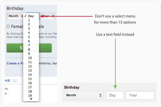
A select menu with over 15 options is just as bad as one with less than 5. When you put that many options in one menu, you’ll slow users down because they’ll have to scan and scroll through the long list. Sometimes the list of options can get so lengthy that the menu takes up the entire screen. When you have more than 15 options in a menu, you should either lessen the amount of options, or use a text field to allow users to enter their own data. An open text field prevents users from having to fiddle with a giant select menu and makes filling out the form faster and easier.
Labeling Select Menus
Like other form elements, a select menu should always have a label next to it. However, you should also have a label inside the select menu that tells users what they’re selecting. The label should clearly and distinctly describe the group of options. A generic label such as “Please Select” isn’t clear enough for accessibility users who use screen readers to fill out forms. Adding a label outside and inside the select menu allows all users to take action quicker without any confusion.
When to Use a Default Select Menu Option
Most of the time, you should avoid giving users a default menu option. This is because if users fill out the form and accidentally miss the select menu, the wrong option could get submitted. It’s safer for users to get an error message for not selecting an option than to submit the form with the wrong option. The only time you should give users a default menu option is when you are certain that over 90% of your users will use that option. This saves the majority of your users time from having to mess with the select menu.
Grouping Select Menu Options
If the options in your select menu have a hierarchy, you should split them into groups using the optgroup tag. This allows users to find the option they want quicker by scanning the group labels instead of every single option. Users won’t be able to select the group labels. They’re only there to give the menu hierarchy and make scanning options easier. Accessibility users also won’t confuse group labels as options because screen readers can’t read them.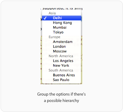
Using Select Menus for Navigation
Select menus are mainly used on forms, but sometimes they’re used for navigation. Some websites will use a select menu to allow users to filter or sort page content. When users select an option, they will navigate to a new page. This approach is accessible to screen readers only if users can tab to the select menu and move through the options with their arrow keys without navigating to a new page. The select menu should only navigate to a new page when the user hits enter. A small minority of screen reader users will have Javascript turned off. In order for select menus to work with Javascript turned off, you need to have a submit button next to it. Users will navigate to a new page after they select an option and hit the button.
Select Menus are Best for Forms, Not Navigation
Although you’ll see select menus used for navigation, it is recommended that you only use them for forms. Mobile websites will often use a select menu for their main navigation to save space. However, there are problems with this approach that affect usability, accessibilty and SEO.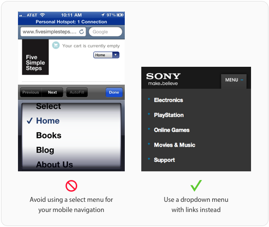
At first glance, a select menu for the main navigation doesn’t cosmetically look right because it doesn’t blend in with the site design. It feels awkward because once you click it, you’ll get the spinning wheel used for picking options on mobile forms. Users have to tap the menu, flick their finger to the right option and press the “Done” button, which is a lot of work. Not to mention, the “Previous”, “Next” and “AutoFill” buttons aren’t even applicable in this situation because you’re not filling out a form.
Users won’t be able to use your select menu navigation if they have Javascript turned off. This is an issue for some screen reader users. A more accessible menu is one that opens the menu when the user tabs to it, and allows them tab through the different options. This can only work if the options in the menu are real links. This is also the same reason select menus don’t offer any search engine optimization benefits. If you want to optimize your navigation for search engines, avoid using a select menu for your navigation and offer users a dropdown menu with real links.
Stop Misusing Select Menus
There are a lot of misused select menus on the web. This happens when people lack a basic of understanding of how to use them. Now that you know, you can help put an end to it by making sureSource: uxmovement.com
Etiquetas:
UI Design
![]()
![]()